Power Gummies
Turning a clinical supplement aisle into a lifestyle and beauty statement.
Services
Brand Strategy
Brand Identity
Packaging
Website Design
APPROACH
A young D2C brand entering one of India's most crowded supplement segments, moving from a single product to a multi-variant range with a kids category on the horizon. The ask was to stand out on the digital shelf, and scale across variants, all within FDA-regulated packaging that made every competitor look identical. Our approach was directional: abandon nutraceutical codes entirely. Where pharma brands reached for clinical authority, we went the other way; beauty and lifestyle. The visual language a GenZ consumer already trusts for skincare and self-care, not supplements.
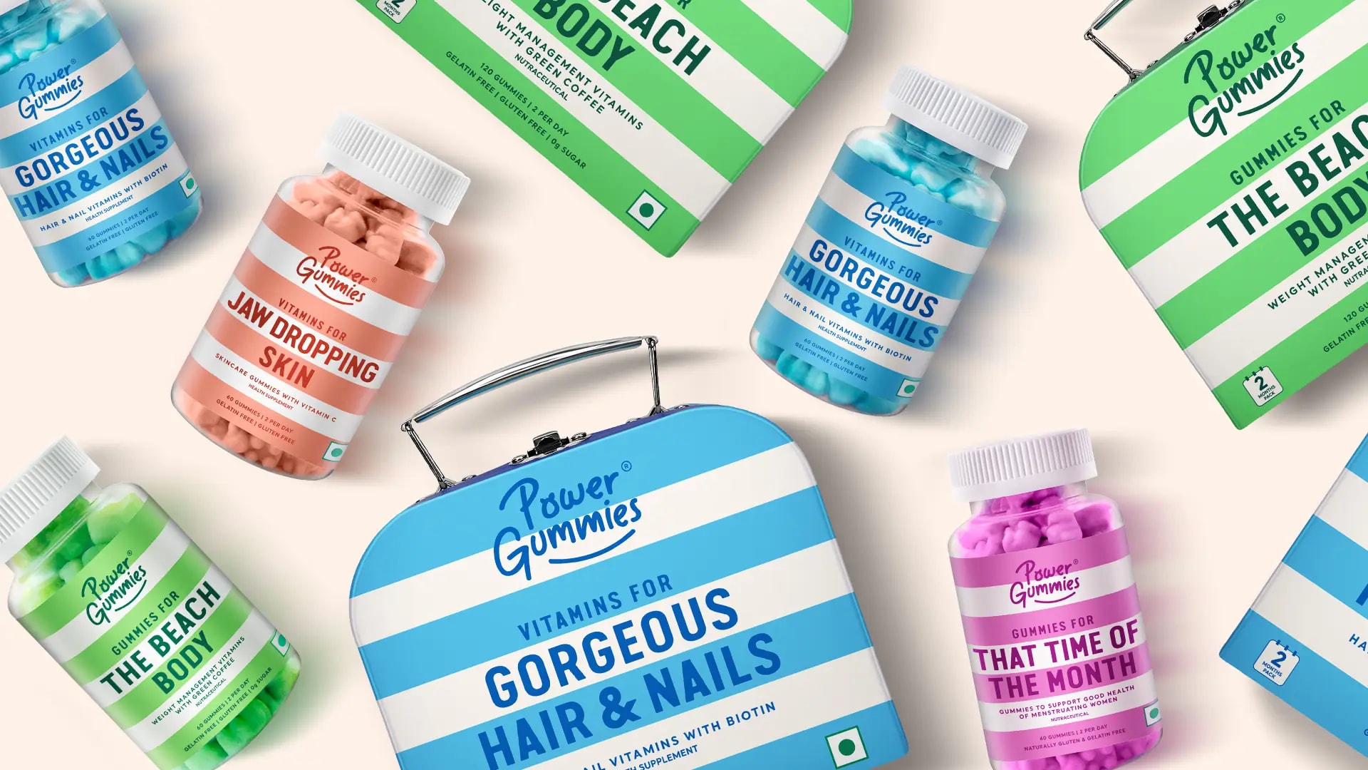
Pantone colour became the strategic tool. Each variant got a distinct, ownable colour, a brand signal built to perform in a display ad as much as on a shelf. Because the primary retail battlefield was never a store. It was the scroll.
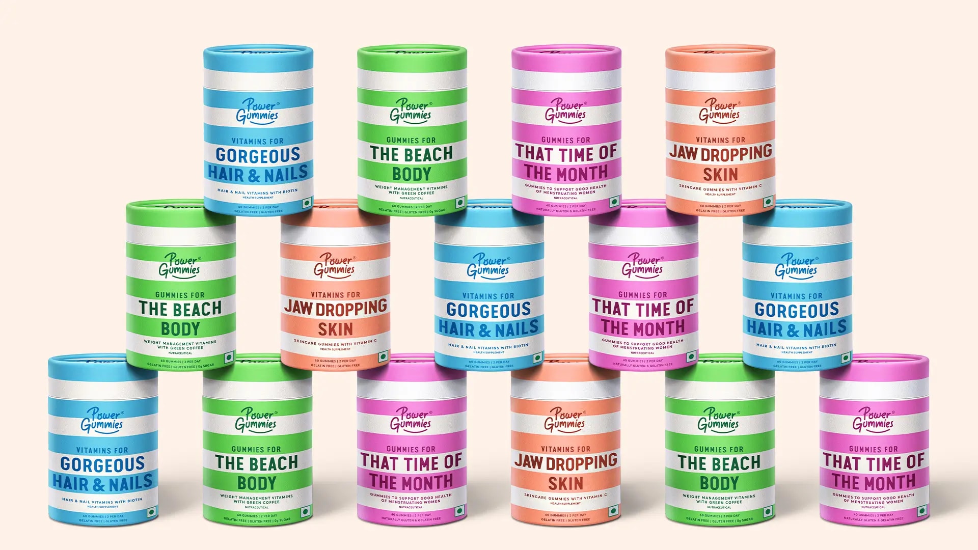
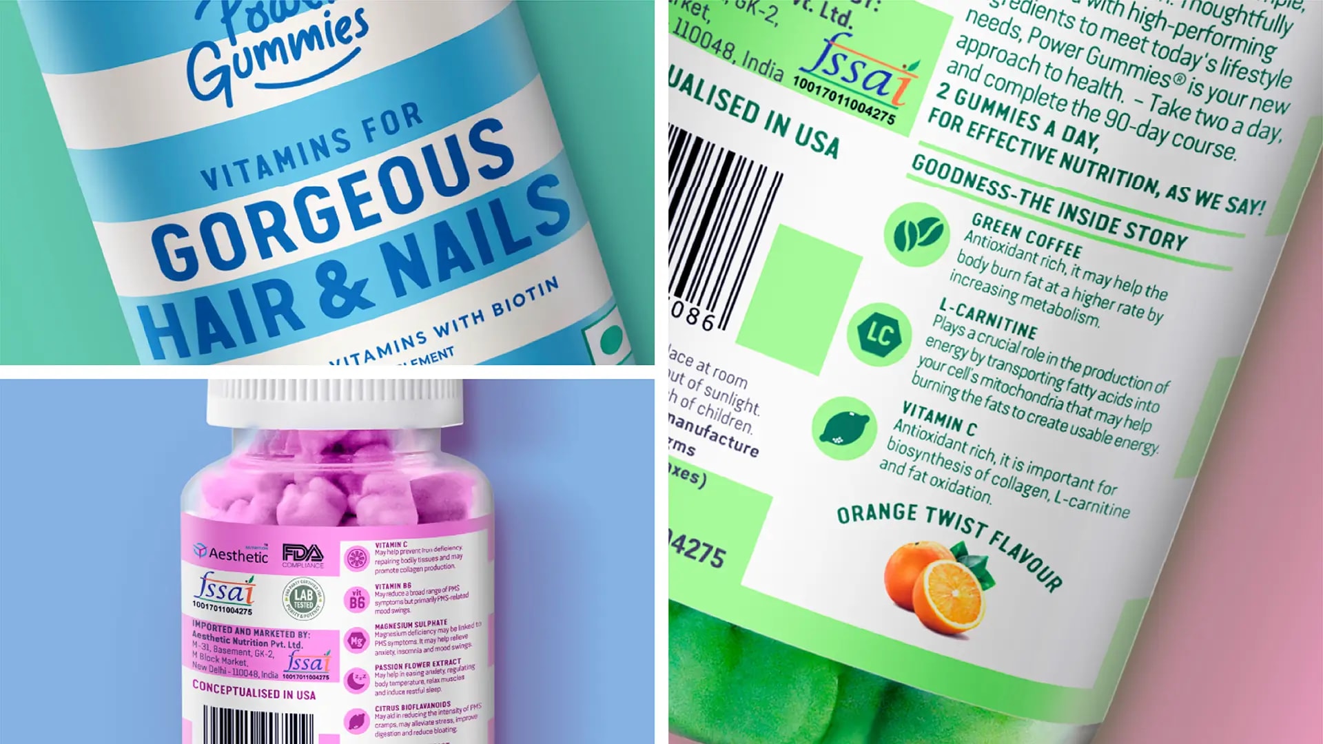
FDA norms meant the bottle was non-negotiable. So we solved shelf standout with an outer pack as a secondary packaging layer built specifically to own product listing pages and cut through on digital display. Where competitors were fighting inside the category, we changed the surface the fight happened on. The only levers available were the label and the outer pack. Those two surfaces had to differentiate, build brand recall, communicate lifestyle, and perform across both physical and digital retail simultaneously.
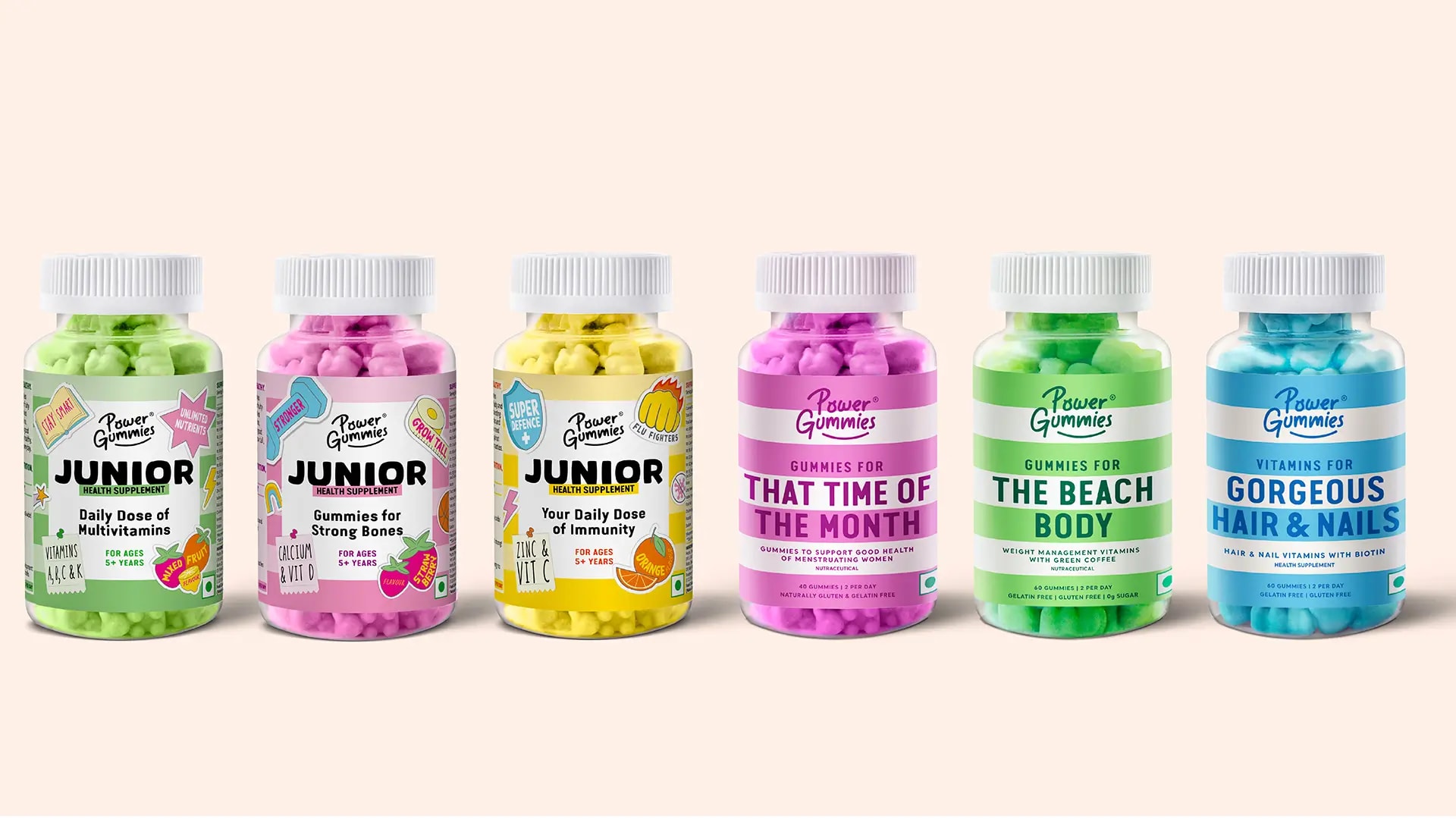
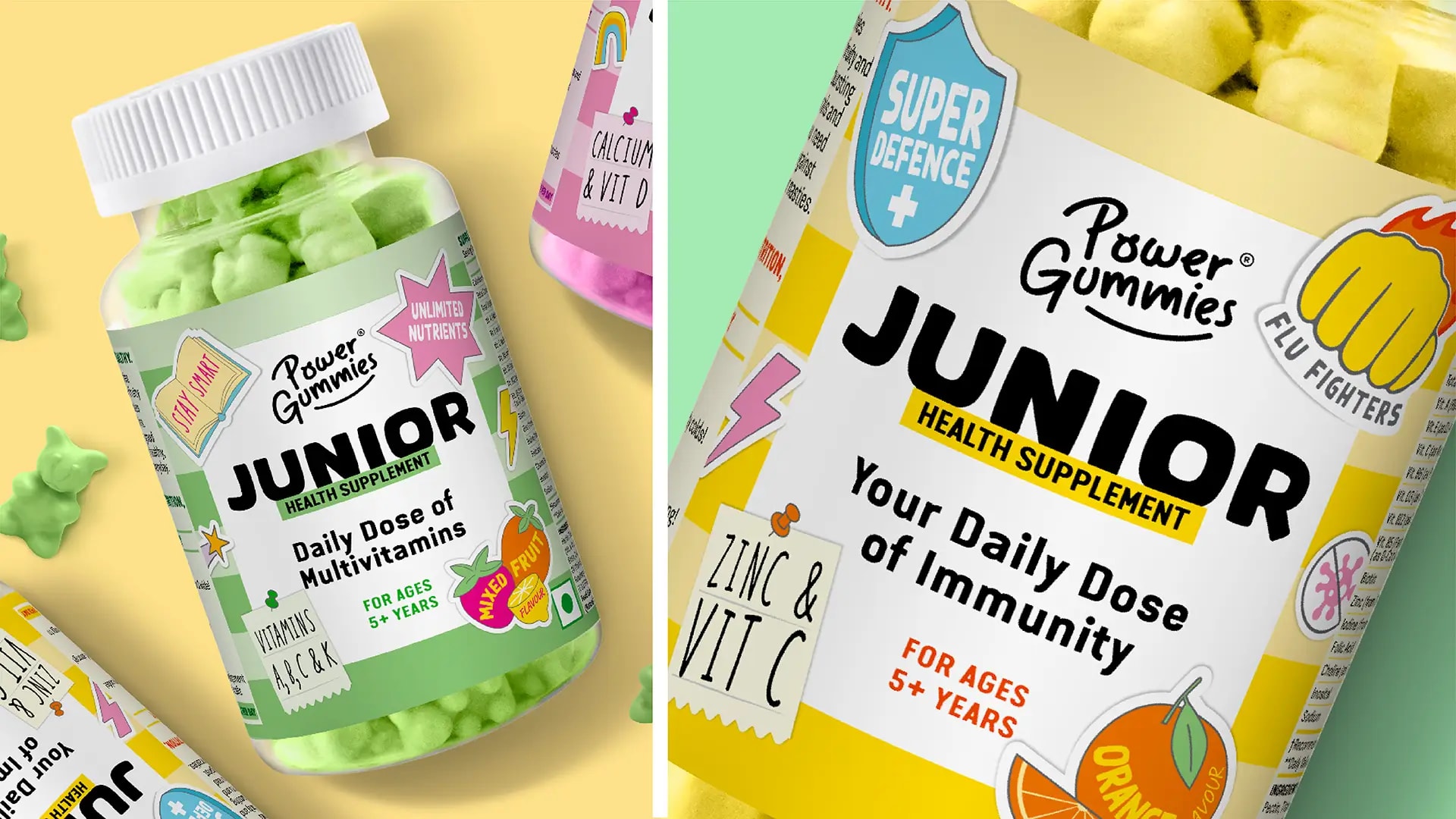
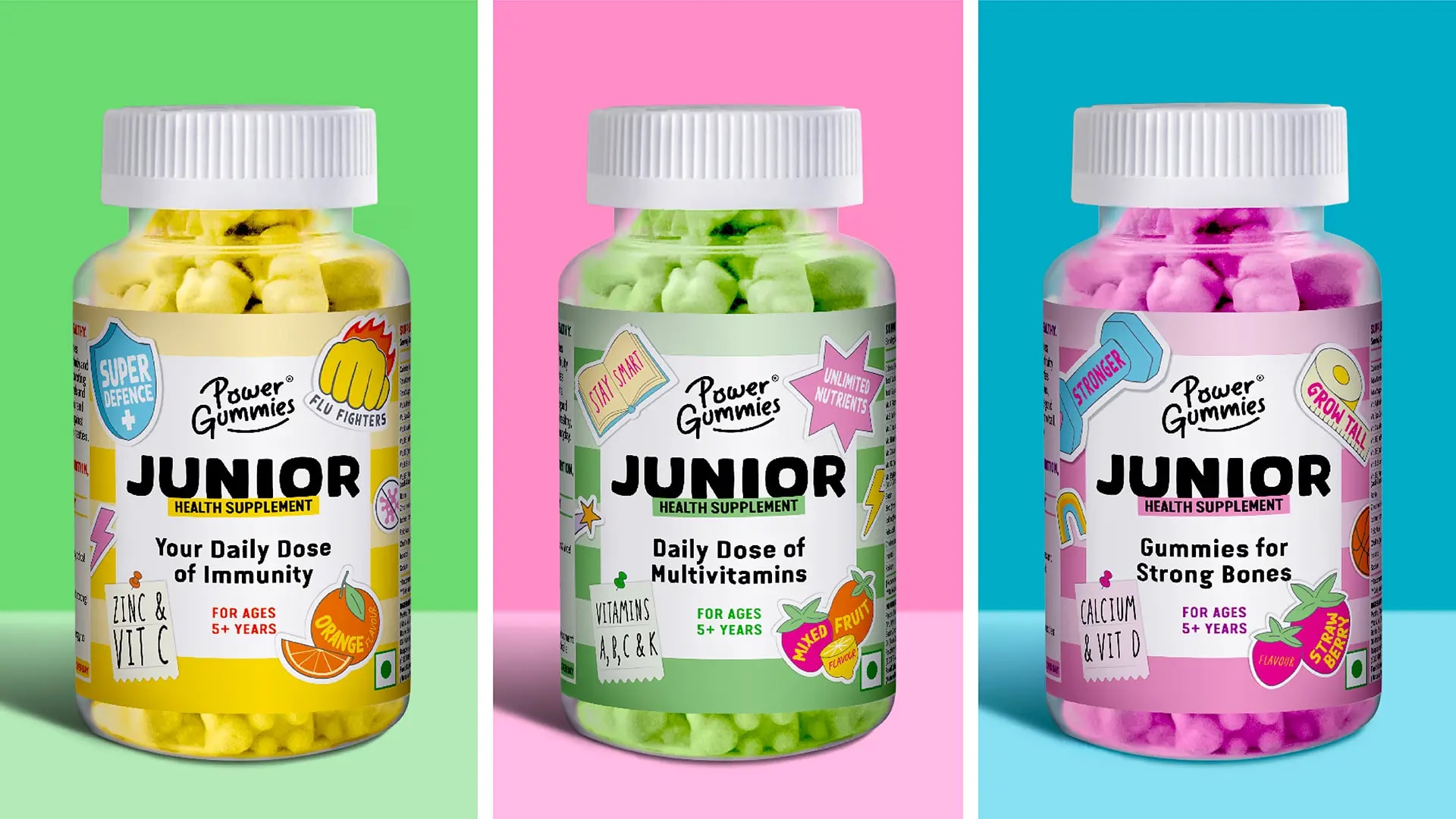
For Power Gummies Junior, we retained the masterbrand's core visual codes and introduced quirky stickers as callouts. A pop design language that speaks to kids while keeping parents' trust. Same system, new energy.