Nama Pet food
Winning trust for a new cat food brand through honest, ingredient-first design.
Services
Nomenclature
Branding
Packaging
APPROACH
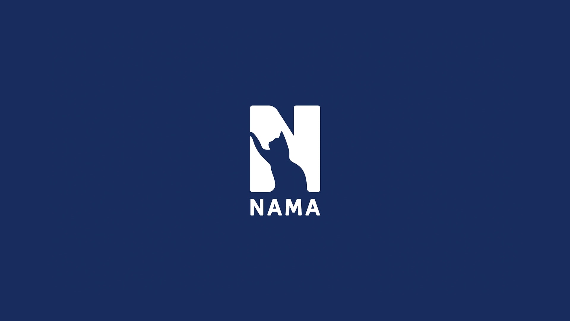
NAMA is a Japanese cat food brand built on honest, minimally processed nutrition: no preservatives, no artificial flavours, no fillers, formulated to Japanese safety standards. As a new entrant, the challenge was standing out on shelves dominated by vague premium claims, while building the kind of trust that gets a wary pet owner to flip the can over. We started with the name itself: NAMA, Japanese for "raw," chosen to carry both provenance and philosophy in a single word. From there, we designed an identity anchored by a mark that hides a stretching cat inside the negative space of the "N," instantly legible as a cat brand, warm rather than clinical, and confident against a deep navy base.
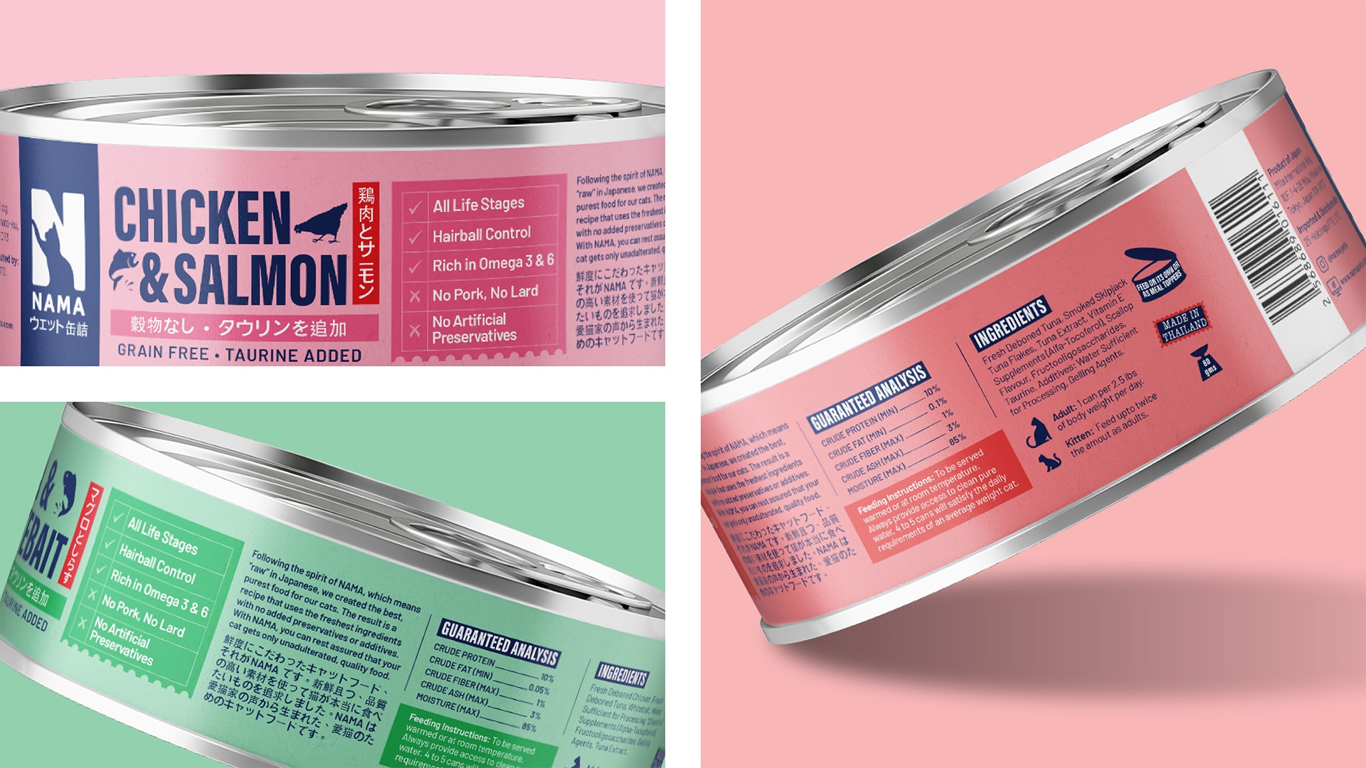
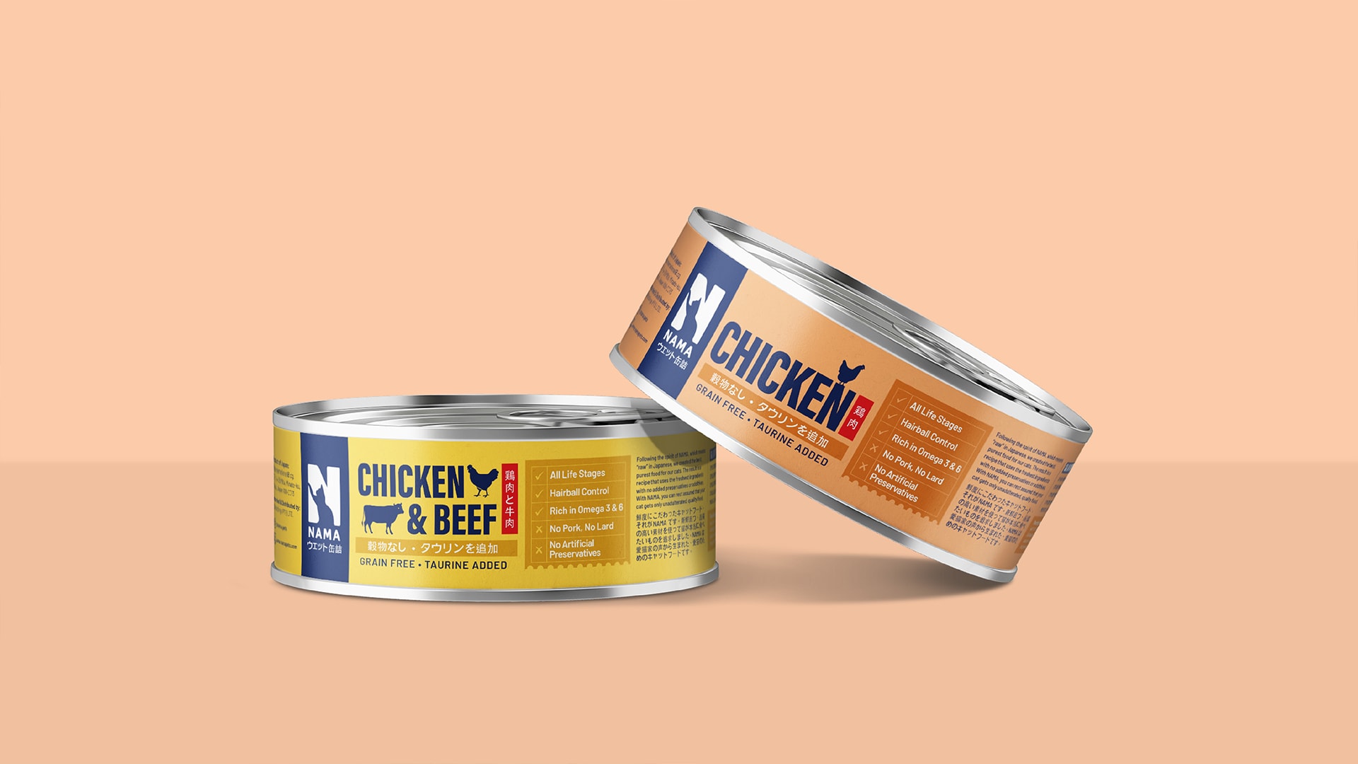
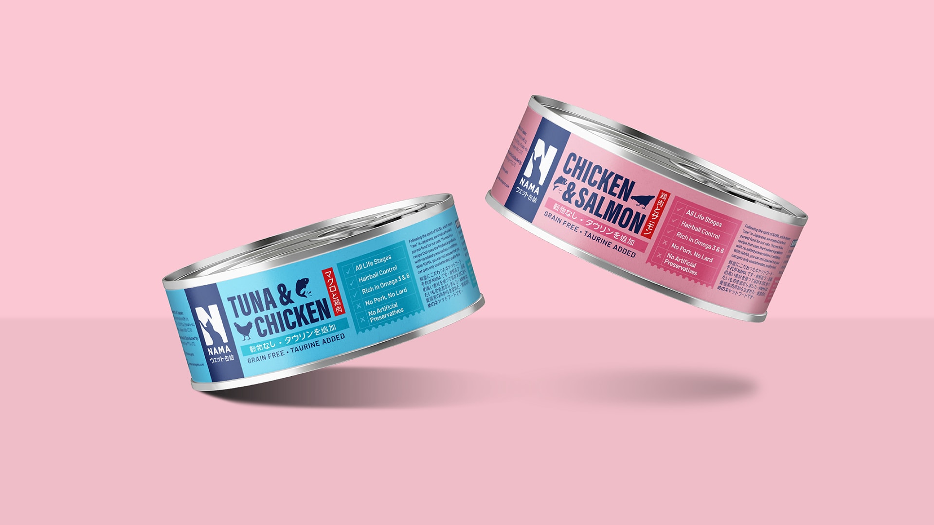
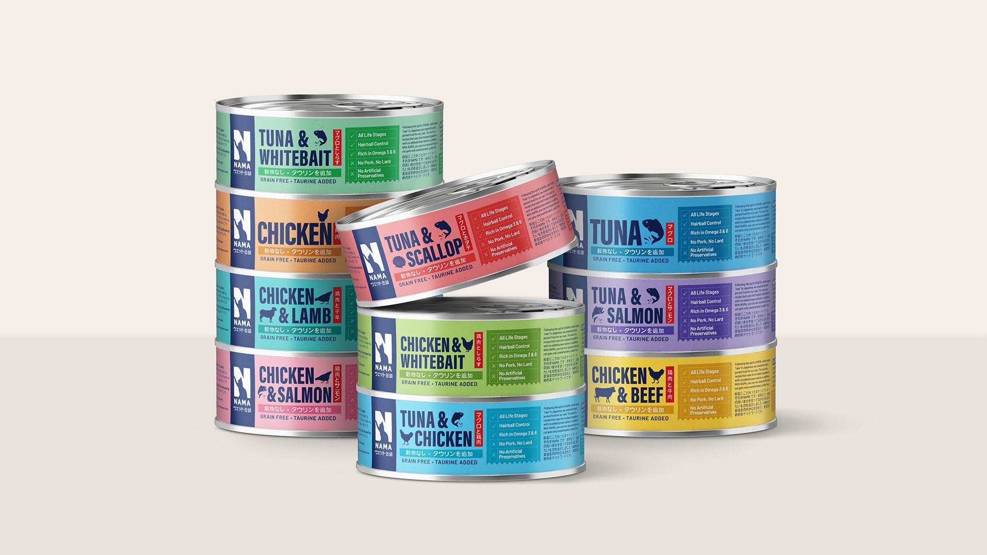
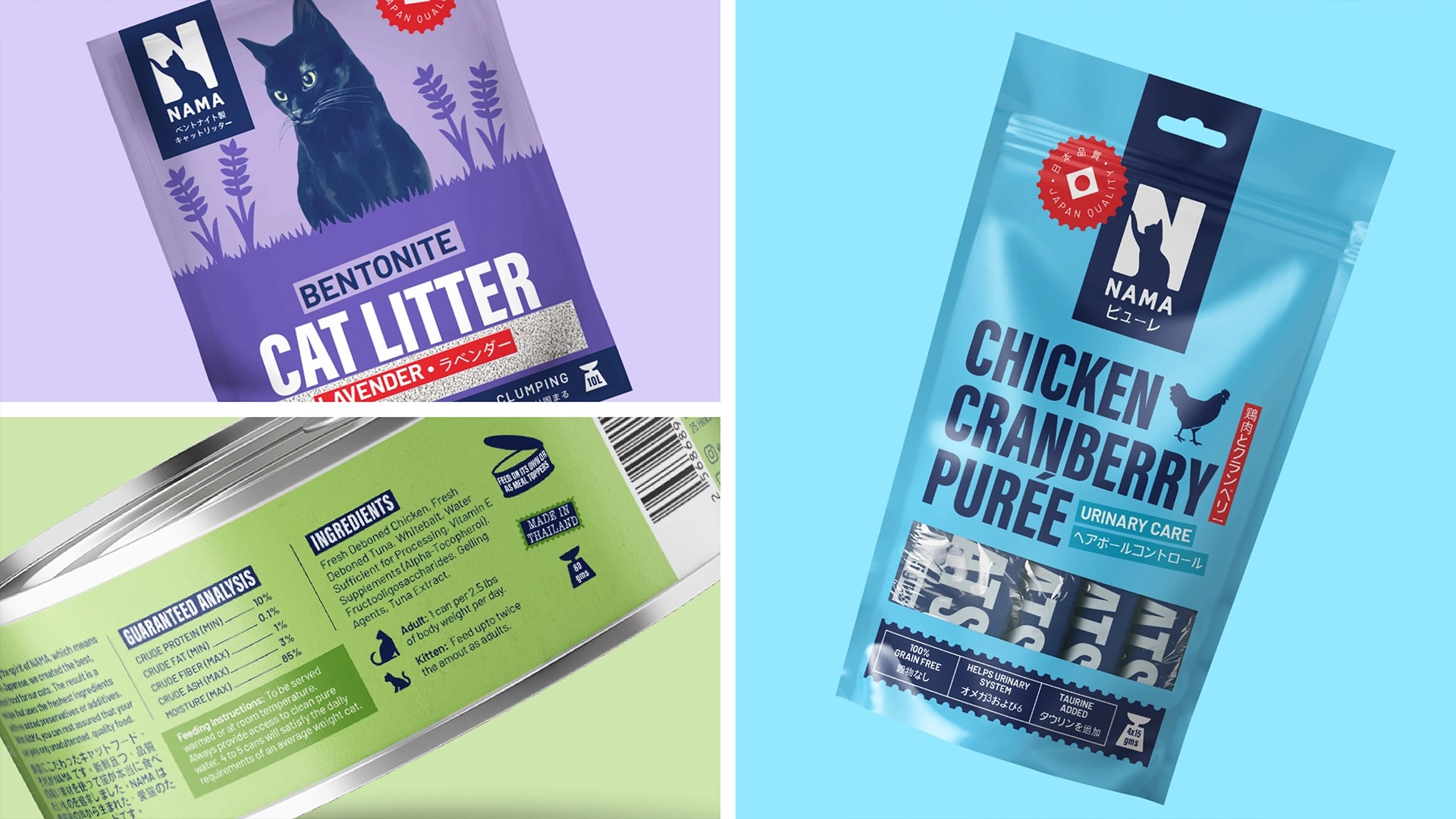
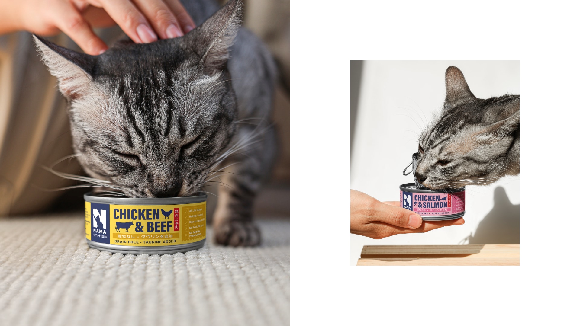
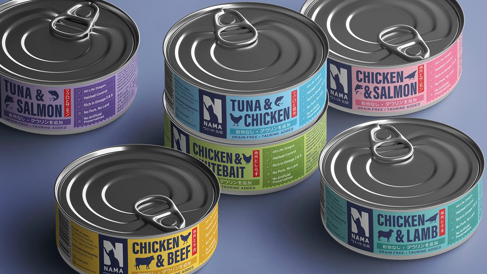
For packaging, we took an ingredient first approach: leading with bold flavour names, simple protein icons, and Japanese language callouts that reinforce origin, backed by a quick scan benefits checklist. Each flavour was given its own saturated colour, turning the full range into a shelf dominating spectrum that reads instantly, at any scale, on a retail shelf or a phone screen.
Nine flavour variants were built on a single, repeatable grid: navy brand block, colour coded flavour panel, benefits checklist, so the system stays consistent while flexing easily for future products. Flat, graphic protein icons keep the illustration style unified across the range without slowing down at small sizes, and the bilingual flavour treatment does double duty as both a wayfinding cue and a quiet credibility signal.
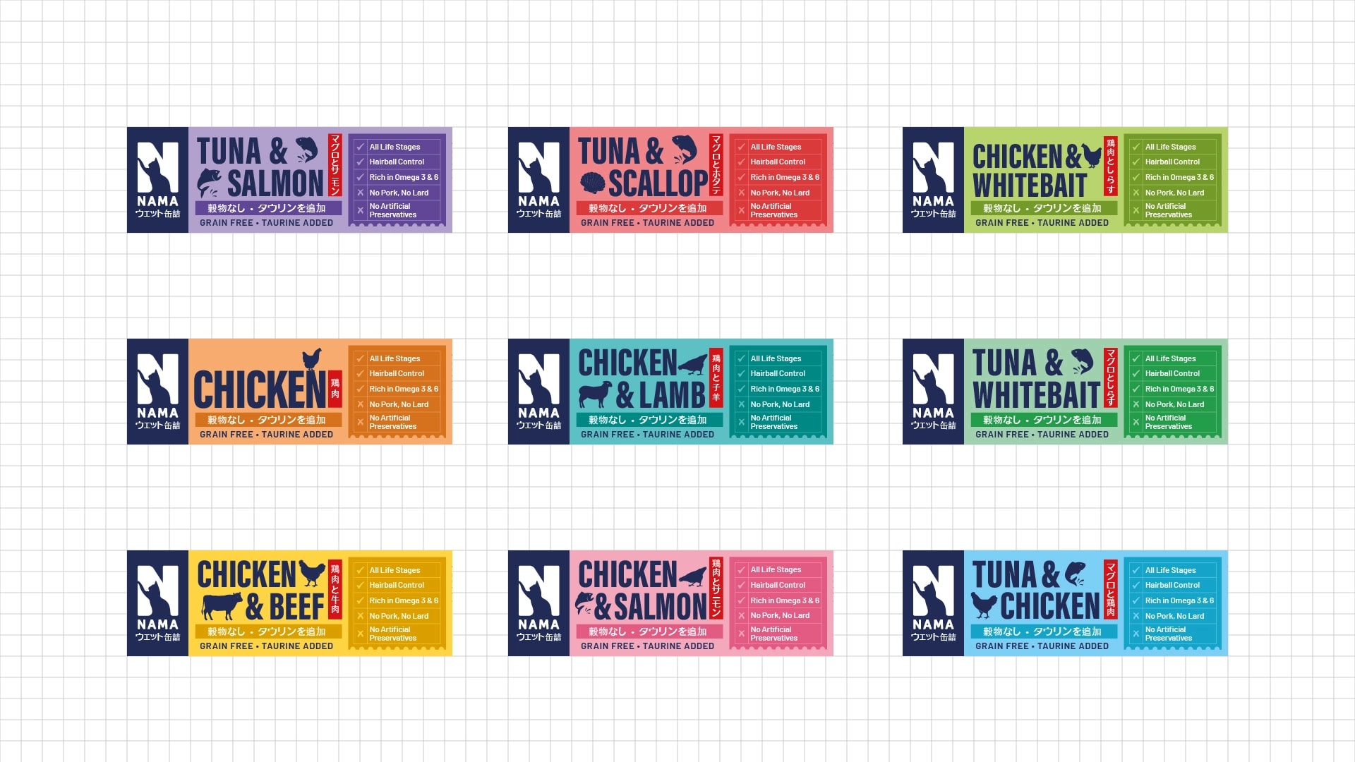
The result is a system built to work hard in two very different environments: dense retail shelves and small digital thumbnails, without losing the warmth and clarity that make NAMA feel like a brand you can actually trust.